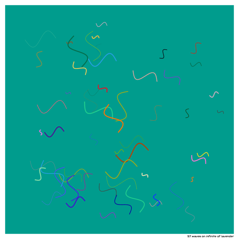
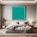
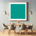
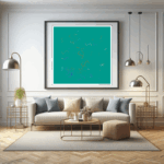
In this artwork, 57 waves unravel on a vibrant “infinite of lavender” background, whose radiant color exudes a refreshing, dynamic energy. The waves travel in bold sweeps and jagged lines, crossing and creating a complex web of travelment and chaos. Each line tells its own story, yet together they merge into a harmonious, unpredictable whole.
The “infinite of lavender” background creates the ideal foundation, intensifying the energy of the lines. This intense color makes the patterns leap, bringing a powerful tension to the piece. The contrast between the calm, even background and the wild motion of the lines forms an intriguing equilibrium.
This artwork celebrates the freedom of randomness and the beauty of spontaneous unraveling. The 57 waves on this lively background invite the viewer to explore the unknown and experience the dynamics of creativity without boundaries.
This unique artwork is available in various formats in my shop. Find the link in my bio and bring it home today!
#contemporaryart #artwork #artistsoninstagram #instaart #generativeart #creative #geometricdesign #fluid shape #minimalart #artdaily #designinspiration #modernart #waveform art #codeart #newmediaart #artoftheday #visualart #geometryart #creativecoding #colorful #digitalart #art #abstractart #artcollector
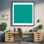
Waves infinite of lavender — minimal generative artwork exploring geometry, rhythm and balance.
Waves infinite of lavender
This generative artwork, titled "57 waves on infinite of lavender", studies waves as a repeating structural element. The composition treats geometry like a simple alphabet: units are placed, rotated and spaced with restrained randomness. The intention is to balance order and variation so the eye moves calmly across the surface.
The color theme "infinite of lavender" works as a quiet foundation. Small changes in tone help separate layers without breaking the minimalist character. Rather than heavy gradients the piece relies on clear edges, consistent spacing and readable figure–ground relationships. This creates an image that stays legible at different viewing distances.
Waves lend themselves to this approach because their outline is easy to read. Minute rotations change their energy and create directionality. In clusters they suggest flow; in isolation they act like anchors that hold the rhythm together. The arrangement aims for tension without noise.
From close range the small decisions become visible: line thickness, micro-rotations, offsets and the way neighboring elements align or miss slightly. From a distance these details merge into diagonals and bands. The work deliberately supports this dual reading, which adds quiet movement without forcing the eye.
Light plays a role as well. On matte papers the surface reads softly and the geometry becomes a gentle texture. Under directional light the crisp edges produce a subtle flicker as the viewer changes position. This interaction keeps the work active without demanding attention.
Details
Additional notes: repetition, spacing and alignment are adjusted in small steps to avoid visible tiling artifacts. The palette around infinite of lavender remains restrained so structure stays primary. The aim is long-term legibility on paper and consistent results across prints.
Printing guidance: smooth, neutral white papers work best. Thin borders and simple frames support the geometry without adding visual weight. For larger sizes keep viewing distance in mind so both micro details and overall rhythm read comfortably.